Over the last several years, WordPress has introduced—and continues to iterate on—the Gutenberg block editor, full-site editing, and block themes. I’ve largely avoided full-site editing and block themes until recently. My thought was: why change when I have a workflow and tools that work? My workflow/tools included building classic themes while relying heavily on the pro version of the Advanced Custom Fields plugin (ACF). I had even begun building custom blocks with ACF, which was, in itself, a big step forward for my development workflow.
From Advanced Custom Fields to block themes
In the last few months, the WordPress founder started a feud (including a lawsuit) with the creator of ACF. The real-world ramifications, as of now, are minimal for developers using ACF. However, it was a shock to my system and way of building WordPress websites.
Learning new things with real projects
I’m currently building two websites using full-site editing and block themes while seeing if I can avoid using ACF (admittedly as a simple tactic to find native solutions first.) Developing block themes has forced me into a new way of building, thinking, and creating. My nature is to write CSS, but instead, I’m pushing myself to find solutions using theme.json or the block editor—all with varying success. I’m deep in the thick of it, trying to make everything work in this new way of building WordPress themes with real-life projects and deadlines. What better way to learn, though, right?
4 tips & tricks for building block themes
Here are a few tips and tricks I’ve picked up for building block themes. AKA, “things I wish someone told me before I started building block themes.”
1. The almighty Group Block

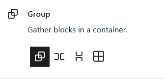
The WordPress Group Block seems to be the block editor’s solution for when, in HTML, you’d want to have a wrapping DIV tag around something. The Group Block lets you set it as a group, row, stack, or grid. Essentially, a DIV with or without Flexbox and Grid.
Oftentimes, if I’m finding limitations when building a custom layout in the block editor, the answer is to group a set of existing blocks, so I can control the layout better. Thinking of my blocks as HTML elements and a series of wrapping DIVs helps me understand when I need more or fewer wrapping DIVs (AKA Group Blocks).
Here’s an example of where several Group Blocks came in handy. I was building a WordPress Template Part – which is considered a WordPress Pattern.

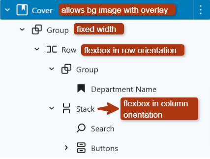
Here’s how I used the block editor to create the above layout.

- If you want a background image that can have an overlay color, the Cover Block is the best option, hence I used that as my parent block to place everything else inside.
- To have a fixed width block of content, use a Group Block with Inner blocks use content width checked. If you are adding Group Blocks to a page or post, you may not have this option because you are adding it to a part of the template that is already inside a parent element that is using the content width.
- Sometimes you want some block settings to apply on mobile and to change that setting on desktop. I don’t believe that’s possible natively in the block editor settings for the Group Block. For example, I needed this setting (below) on a Group Block to be ‘Fixed’ on desktop, but set to ‘Grow’ only on mobile, but couldn’t find a way…which leads me to my next tip – custom CSS/JS.

2. Get as close as you can, then add custom CSS or JS
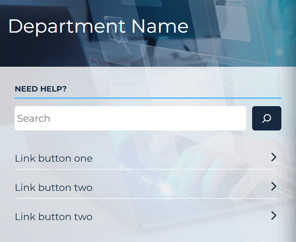
I try as hard as I can to build my layouts using the blocks and settings the block editor provides, but sometimes, you hit a limit. For example, I wanted this layout on mobile:

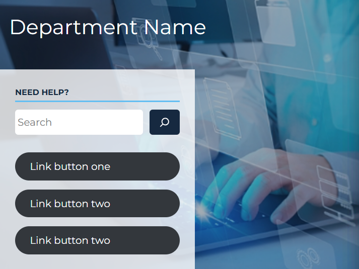
But no matter what settings I applied in the block editor, I could only get this:

I wanted to have a fixed width on desktop but flex-grow: 1 (full-width) on mobile. The Group Block settings didn’t allow both to be set at the same time.
My solution was to add a class to the Group Block and simply apply flex-grow: 1 CSS on screens smaller than a certain width. Sometimes, adding a bit of custom CSS is necessary when you’ve exhausted the current possibilities of the block editor.
Additionally the links under the search were not looking great. So I styled them with custom CSS and JS. The following JavaScript was used to add the right-pointing arrows on page load.
  const itsBtnArrow = document.createElement("i");

  itsBtnArrow.classList.add("fas", "fa-chevron-right");

  itsBtnArrow.setAttribute("aria-hidden", "true");

  document.querySelectorAll(".wp-block-button.btn-with-arrow a").forEach((element) => {
    const arrow = itsBtnArrow.cloneNode(true);
    element.append(arrow);
  });
And here was the custom CSS for these buttons:
.wp-block-button.btn-with-arrow a,
.wp-block-button.btn-with-arrow div {
  display: flex;
  justify-content: space-between;
  border-bottom: 1px solid #fff;
  border-radius: 0;
  background-color: inherit;
  padding: 0.5rem 0;
  color: var(--wp--preset--color--dark-blue);
}
I could have used a block style variation, which would give me the ability to toggle my custom styles directly in the block settings. I opted not to use block style variations for this one because it was a one-off need that I would never use on the rest of the website.
3. Using color presets from theme.json in CSS
As I’m migrating a classic theme to a block theme, I’ve really enjoyed using theme.json to add colors and fonts and then using those in my CSS files. Here’s how I did that with my colors:
Create a color palette in theme.json
{
  "$schema": "https://schemas.wp.org/wp/6.6/theme.json",
  "settings": {
    "color": {
      "palette": [
        {
          "slug": "dark-blue",
          "color": "#172940",
          "name": "Dark Blue"
        },
        {
          "slug": "light-blue",
          "color": "#63bef2",
          "name": "Light Blue"
        }
      ]
    }
...rest of file removed...
}
Then in my CSS file that I’m migrating, I use the color presets from theme.json like this:
#white-top-nav .link-button {
  background: var(--wp--preset--color--light-blue);
  border: 1px solid var(--wp--preset--color--light-blue);
  color: var(--wp--preset--color--dark-blue);
}
These presets (be it color, typefaces, or anything else) that are set in theme.json can be used in CSS files using this format: var( –wp–preset–{$feature}–{$slug} ) Learn more about presets here. Don’t ask me how much googling I had to do find that CSS variable recipe and explanation. 🙂
4. Don’t rely on generative AI
I often ask ChatGPT or Google Gemini my web development questions, but AI isn’t as reliable for block theme development questions. Unfortunately, the answers these tools have provided me are outdated or simply incorrect. This is because the block editor, full site editing and WordPress development is rapidly changing. I recommend searching WordPress developer resources or using Google. One caveat for asking AI, is that it can help you brainstorm how to solve a problem because it often gives you several options to try. It may provide all incorrect answers, but it has sometimes opened my mind to different ways to approach a particular problem.
Much more to learn
This is the just the beginning of learning to build block themes. I’m sure I’ll find more ways to build complex layouts while balancing custom code with theme.json and the block editor. I look forward to blogging about what else I learn.
Leave a reply